Profiles
Down to Earth: Architect Thomas Phifer’s explorations of architecture for art
by Thomas De Monchaux
Profile

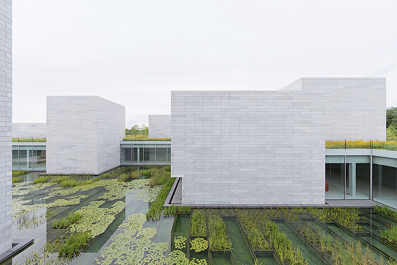
Glenstone Museum, Potomac MD, 2018. Photo: Iwan Baan
- 10 March 2019
‘Clarity. And warm bread.‘
Those are the two things that architect Thomas Phifer remembers most indelibly from Italy in 1976—his first time living outside his native South Carolina—while attending a Genoa academy affiliated with Clemson University, his alma mater. The rustic bread, ‘a revelation to someone accustomed to the sliced-in-a-plastic-bag kind,’ came steaming from the bakery downstairs each morning. The clarity, as it has for generations of American architects taking the traditional grand tour of Athens and Rome, the Near East and North Africa, came from the old stone monuments of the classical world—amplified years later by a residency at the American Academy in Rome.
Of Rome, Phifer recalls less the well-trafficked Forum than the adjacent Palatine Hill, in which the ruined villas and palaces of ancient aristocrats and emperors have become so embedded in two millennia of geology that the lines between architecture and landscape have blurred. Phifer remembers especially, during his college travels, a visit to the Dulwich Picture Gallery in London, Britain’s oldest public art museum. The 1815 design by the radical classical architect and antiquarian Sir John Soane features a system of greenhouse-like rooftop lanterns, innovative for its time, that direct a diffuse—and, for a gray metropolis, surprisingly luminous—daylight onto the Poussins and Gainsboroughs below. ‘It was a clarity about daylight,’ recalls Phifer, ‘and the movement of light.’
Back in America, after a decade working with architect Richard Meier—whose signature white-walled grid-plus-curve motifs were epitomized in Los Angeles’ own modern acropolis, the Getty Center—Phifer began his own practice in 1997. He produced a series of celebrated houses and pavilions that he describes now as ‘light buildings that landed lightly on the land.’ Silvery and sprightly in reflective glass or white-coated steel, all stilts and fins and latticework meshes, these buildings combine an expression of technology and tectonics gratifying to any admirer of High Tech monuments like Richard Rogers and Renzo Piano’s 1970 Pompidou Center in Paris. Phifer’s early buildings have a tendency—thanks to slender but deeply overhanging eaves or diaphanous walls that surpass the boxes they bound, shedding layers as they go—to melt into air. But when he made them, he was still very much in the process of learning what he wanted. ‘Even though the buildings that were done then seem very calm and simply organized,’ he says, ‘I was unsettled about the work.’

Corning Museum of Glass, Corning NY, 2018. Artwork: Javier Pérez, Carroña (Carrion), 2011. Photo: Scott Frances

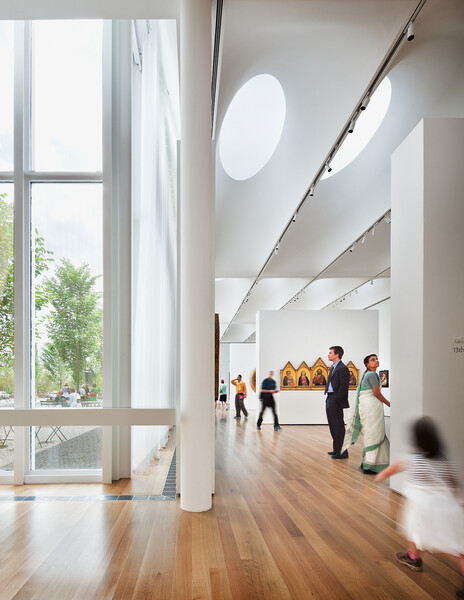
North Carolina Museum of Art, Raleigh NC. Photo: Scott Frances
What unsettled him was that the buildings themselves were unsettled in their relation to the ground upon which they sat, seeming to float above it. After mastering a certain soap-bubble lightness, he wanted to understand how a building could be more like a river stone, embedded in the flow of its place. ‘We were trying to get at this heaviness,’ says Phifer of his practice, ‘to get down to earth. ‘Landscape’ seems to me like a stiff word, but the word ‘land’ carries the weight of the world. I think when you talk of the work of Michael Heizer’—the sculptor whose 1970 piece Double Negative, two 50-foot trenches incised into the edge of a Nevada mesa, helped birth the Land Art movement—‘you don’t say that he was digging into the ‘landscape’. You say the ‘earth.’ The earth that Phifer eventually found his own way into—not coincidentally in the occasional company of Heizer himself—is situated on a few hundred rolling acres in Potomac, Maryland, on a low hill once dotted with dairy barns and stables.
The land is part of the estate of Mitchell P. Rales, a billionaire industrialist, and his wife, Emily Wei Rales, a curator and art historian, who, in 2006, opened the Glenstone Museum—Glen for neighboring Glen Road, stone in honor of nearby quarries—to display pieces from their substantial collection of post-World War II art, in a building designed by Meier’s close contemporary, Charles Gwathmey. Phifer’s new addition—a short walk away through glades and wildflowers configured by the landscape design firm of Peter Walker—is, in its own way, all glen and stone. It’s a freestanding complex of some dozen granitic and prismatic cast concrete pavilions embedded into grassy berms and swales, half-buried like the ruins of Rome’s Palatine Hill, all arranged around a central sunken water garden and accompanied by separate wood-clad amenity and admission pavilions. The $200 million complex, which opened in October to critical acclaim, adds some 50,000 square feet of gallery space to the 9,000 square feet of the original Gwathmey structure and is projected to accommodate a tenfold increase in visitors, to some 100,000 a year.
After mastering a certain soap-bubble lightness, he wanted to understand how a building could be more like a river stone, embedded in the flow of its place.
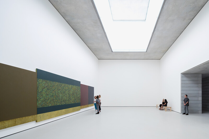
Most of Phifer’s skylighted but largely windowless gallery pavilions are customized to the long-term display of work by a single artist—Michael Heizer, Roni Horn, Brice Marden, Cy Twombly, Lygia Pape, Pipilotti Rist and others. Visitors move between the pavilion rooms in tunnel-like passageways and around a glassy cloister surrounding the water garden. ‘There’s the memory of Ryōan-ji, of losing the horizon and what happens then,’ says Phifer, referring to the 17th-century clay-walled rock garden in Kyoto that is all sky and ground, air and earth. That Japanese rock garden features 15 boulders, some in compositions not so different from the subtly pinwheeling array of Phifer’s boxy and stony pavilions.
One of his pavilions, with a prodigious 18-foot-deep single-pour concrete soffit overhead—and an even taller pane of glass that unexpectedly lines one side of a relatively narrow slot cut into its seeming mass—accommodates the entrance. Another pavilion, a kind of visual breakout room distinguished by a wooden lining and a vast window, looks out and away from the cloister, toward a meadowy vale. The view from that window, in the context of an art museum, necessarily becomes another kind of picture, and its prominence underscores an essential element of Phifer’s thinking. The stiffness connoted for him in the word landscape seems to derive, at least in part, from its function as a pictorial word, like the word portrait, already framed and hung. Architecture has long had a fraught relationship with art, to which it intentionally or inadvertently provides the pedestal or enclosure.
To neoclassical architects like Soane, architecture was itself the Mother Art, on a continuum of plasticity and proportionality with the sculpture and drawing that architects long obliged themselves to master. And yet a work of architecture’s defining distinction, separating it from a notionally more self-referential or self-reliant artwork, is its service to what architects call program: the sheltering of the events and people and things that take place within. The accommodation of art, and the ritual of its experiencing, is a special case of that sheltering. Different eras of design have deferred to and accommodated art in different ways—the palatial ‘enfilade’ of salons established by Soane at Dulwich; the ‘neutral’ white-cube galleries of the 20th century; the adaptive reuse of large-scale industrial warehouses and factories born of the good-bones, low-rent structures legendarily converted into studios and homes by artists beginning in the 1960s and 1970s in neighborhoods like Manhattan’s SoHo.
The non-neutrality of an ostensibly neutral gallery space, even and especially of clinic-white walls, was made plain by Brian O’Doherty in his canonical 1976 essay ‘Inside the White Cube,’ which described such space as a kind of wishful fiction: ‘The outside world must not come in. Walls are painted white. Unshadowed, white, clean, artificial—the space is devoted to technology of esthetics.…Ungrubby surfaces are untouched by time and its vicissitudes. Art exists in a kind of eternity of display, and though there is lots of ‘period’ (late modern), there is no time.’
Phifer describes this yearning for timelessness, for ‘a container without character,’ as a misunderstanding of Modernism: ‘The best artwork gets challenged a bit by its architecture.’ This capacity to withstand—indeed to inspire—a meaningfully challenging context might be one definition of successful art, and conversely, the provision of such a context might define successful architecture. One purpose of a gallery, both literally and figuratively, is to prompt points of view on the work it contains. A contemporary challenge is that the adapted former industrial spaces that were once, in their picturesquely grubby character, such a tonic to the false neutrality of the white cube have now, in their success, become another kind of default setting into which all sorts of connotations and associations are already tacitly embedded—another impetus for Phifer and his contemporaries, in designing art spaces, to try to establish new terms.
His own understanding of container and character was developed in two earlier major American museum projects. His building for the North Carolina Museum of Art in Raleigh, opened in 2010, is essentially a single 65,000-square-foot gallery room, divided by a composition of thick partitions that stop well below a dramatic ceiling—a sweeping array of filtered elliptical skylights that resolve through double-curved vaults into a grid of narrow rectangular panels. Sculpture courts—one of them a reflection pool, anticipating Glenstone’s water garden—form notches around the main space’s perimeter and function like outdoor rooms. A big box under a big roof, the North Carolina Museum encourages a kind of speculative, wandering drift by visitors—accomplished by leaving open the corners of the spaces defined by the partitions and by sustaining a kind of optical orientation along the grain of the visually stimulating ceiling. The idea of universal flexibility under a do-it-all roof is a longtime dream of modern architecture, dating back at least as far as the early work of Mies van der Rohe and epitomized by his 1968 Berlin Neue Nationalgalerie, which is seemingly a floating roof, with near-invisible glass facades somewhere far behind the perimeter of its profound overhangs. But as Phifer acknowledges, ‘Flexible spaces can sometimes become noncommittal, and sometimes you need commitment. Sometimes the room has to be accommodated with the work.’

Glenstone Museum, Potomac MD, 2018. Artwork: Brice Marden, Moss Sutra With the Seasons, 2010–15. Photo: Iwan Baan
If you could map the looping, drifting trajectories of the North Carolina Museum’s visitors between all those partitions, you might find the almost calligraphic lines of the kind traced by the internal partition walls of Phifer’s 2015 Corning Museum of Glass Contemporary Art + Design Wing, at a former industrial site in Corning, New York. Viewed from above, these lines form a sinuous figure suspended inside rectilinear edges. The curves of the cyclorama-like white-plastered walls stop well below the ceiling, as in North Carolina, and amplify effects of daylight and shadow. Since glass art—unlike paintings or works on paper—can hold up under, and in fact invites, unusually bright daylight, the ceiling above is almost all glass between fin-like beams. The curves below direct visitors’ footsteps and sight lines away from the walls and toward the in-the-round displays of three-dimensional objects. Interestingly, one of Phifer’s inspirations for these curves against straight edges came not from fellow architects but from a painter. ‘I love Brice Marden’s work,’ Phifer told me at the time of the design. ‘I began to look at his paintings very closely—he takes these ribbons of color, he connects them and directs them. I love the interactions with the edge of the painting, that wonderful tension there.’
‘In architecture, if you’re not shaky, you’re not being curious.’
At Corning, the idea of the white cube is somehow turned inside out: The exterior of the cubical gallery volume was engineered, through glass encasing various polyvinyl laminates, to produce perhaps the whitest white that’s materially possible—in stark juxtaposition to the weathered patinas of the surrounding manufacturing campus and the charcoal-like cladding that Phifer gave to an adjacent sawtooth-roofed structure, formerly a Steuben Glass factory building, now a theater. This juxtaposition of light and dark volumes anticipates a current work-in-progress by Phifer, the Museum of Modern Art and TR Warszawa Theater in Warsaw, Poland, in which, as if in an impossible chess endgame with only two pieces, a dark cast-steel performance center uncannily counterbalances a pale concrete gallery block.
Marden has returned to Phifer as one of the artists whose work, in a pas de deux of architecture and art, occupies a singular room at Glenstone. So too, does the work of the painter Cy Twombly, another master of calligraphic ribbons inscribed within rectangles, who died in 2011. The year before, Phifer visited Twombly at a storefront studio he kept in the small town where he was born, Lexington, Virginia. The work space was a deep and narrow former eye-doctor’s office, a remarkably pedestrian room whose linoleum-floored humility has been documented in Remembered Light, a project by the photographer Sally Mann. Phifer recalls his practice being in a state of philosophical flux during this period, and his nervousness about meeting Twombly, whose work had long influenced his design thinking, compounded his general anxiety. But ‘in architecture, if you’re not shaky, you’re not being curious,’ he says. He was surprised by the studio. ‘It had all come out of there: just a storefront studio with a nine-foot drop ceiling. It took a minute to get my head around that.’ Phifer remembered that Twombly spoke relatively little of his own gallery pavilion at Glenstone. ‘He talked instead about the ensemble. He said that you need to move toward abstraction. He was an amazing critic of architecture.’

Glenstone Museum, Potomac MD, 2018. Photo: Iwan Baan

Glenstone Museum, Potomac MD, 2018. Photo: Iwan Baan
The memory of that Lexington storefront echoed in Phifer’s reflections to me about the kind of space we call a room: ‘Rooms have height and depth and width. They have ways of entering. They have their own character. They have openings. They have proportions. They are rooms. They are not flexible spaces.’ About Glenstone, he said, ‘Because it’s an embedded building’—embedded perhaps like a storefront in a small town main street—‘it’s not a reversible building.’ The room intended for Twombly’s work has one of the more striking approaches among the Glenstone pavilions. A long, shadowy passageway gives way to a tall room with proportions almost like one cube stacked above another. ‘Daylight comes from above, and we’re not filtering it very much,’ Phifer says. ‘There’s just 45 feet of height for the light to fall on the work.’ One way in which Phifer’s rooms at Glenstone, unlike the white cube of Doherty’s critique, admit the outside world and acknowledge time is through the absence of artificial lighting. The rooms are illuminated by daylight alone, and their experience thus changes by the hour and the season. ‘On a darkened day in December,’ says Phifer of Twombly’s room, ‘the work is going to be brooding.’
‘It was very simple for him,’ Phifer says of the sculptor Michael Heizer. ‘How far you go down is how far you go up.’
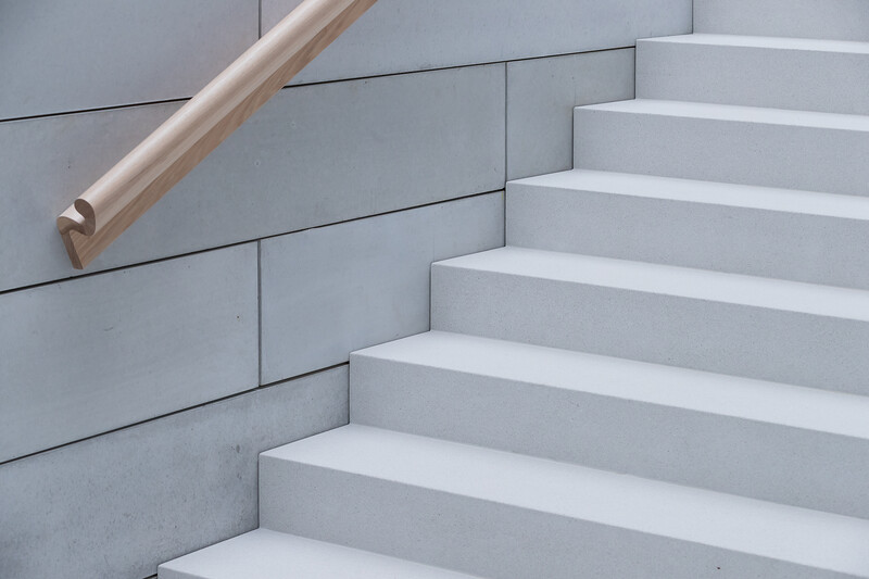
At Glenstone, there’s also not much that’s white. Inside, the pavilion walls and floors are mostly cast concrete, while outside, they have been clad in unusual masonry: more concrete, but cast into blocks (in whole-number dimensions of one foot by one foot by six feet that recall the scale of the human body), and then stacked into walls like oversized bricks. ‘We cast 25,000 of them on-site in just 12 months,’ says Phifer. ‘And if you’re so lucky as to have it be raining when you strip the cast from the concrete, you get these streaks,’ subtle watermarks that travel in a sinuous but syncopated way across the grid of the blocks. ‘It’s raw,’ says Phifer, ‘but extremely precise’—more, perhaps, like a piece of Genoa bread, touched irreversibly by vicissitude, than a pre-cut slice from an industrially uniform loaf.
A serendipitous virtue of those cast blocks—at least in the context of some architects’ and artists’ affection for thinking in multiples of certain measurements—is that they could be stacked to a height of precisely 192 inches, which proved to be significant in one important case. ‘What I learned from Michael Heizer,’ says Phifer, ‘is that he went below the horizon.’ Phifer’s pavilion for Heizer is open to the sky, another lost-horizon courtyard and Ryōan-ji, enclosing the 1967–2016 sculpture ‘Collapse,’ in which long, square tubes of Cor-Ten weathering steel poke out of a rectangular pit lined with the same material and set into the earth. The rectangle of the pit is misaligned with the rectangle of the courtyard. The ground in between was originally to be covered in gray gravel to match the concrete walls, ‘but six months out, he changed the gravel to red,’ says Phifer, extending the rusty russet of the weathering steel, ‘and that changed everything.’ Heizer also wanted to set the height of the walls to match the depth of the pit, and it turned out that both dimensions could be resolved evenly to 192 inches, rising and descending. ‘It was very simple for him,’ Phifer recalls. ‘How far you go down is how far you go up. ‘I wish we could all have that kind of clarity.’ –
Thomas De Monchaux teaches design at Columbia University’s Graduate School of Architecture, Planning and Preservation. He was the inaugural recipient of the Winterhouse Award for Design Writing and Criticism. His book ‘Slow House: Fixtures, Features, Masters, Neighbors, and a Year in Pursuit of a Sweeter American Home’ is forthcoming. His writing has appeared in The New Yorker, The New York Times, Artforum and n+1.
